A friend recently sent me this card. I don't usually like cards in this general style, but I really like this one!
I like the design of the birds and the color of orange they are surrounded in. It makes me think they are super-birds just chilling in a lava flow!
Card is from Hallmark.
Showing posts with label stationary. Show all posts
Saturday, September 21, 2013
Wednesday, January 16, 2013
In the Papier: Flower Power
I indulgently went to Michaels over the weekend. I always tell myself that this time I won't browse the discount racks 'for curiosity's sake' and of course I always do.
But this time I'm a little glad that I didn't miss out on these cards, because I really like them a lot!
The last is definitely my favorite.
But this time I'm a little glad that I didn't miss out on these cards, because I really like them a lot!
The last is definitely my favorite.
Monday, September 10, 2012
In the Papier: Wonderous Design (Vintage DC Comics, Part 4)
Saturday, September 8, 2012
In the Papier: Doomed Young Love (Vintage DC Comics Part 3)
There are/were some pretty weird (and oh so stereotypical) comics for the ladies. The sad protagonists are losing in love. It's clobbering time on your self-esteem, girls! Come on, fork over the 15 cents for the latest issue! You know you want to!
Methinks it's time to give up on love.
![]() |
| Can any man be trusted???????? |
![]() |
| This is my favorite. Find out who wins: Groovy Girl or The Doormat! |
![]() |
| Even Supergirl's heart is broken. |
Methinks it's time to give up on love.
Friday, September 7, 2012
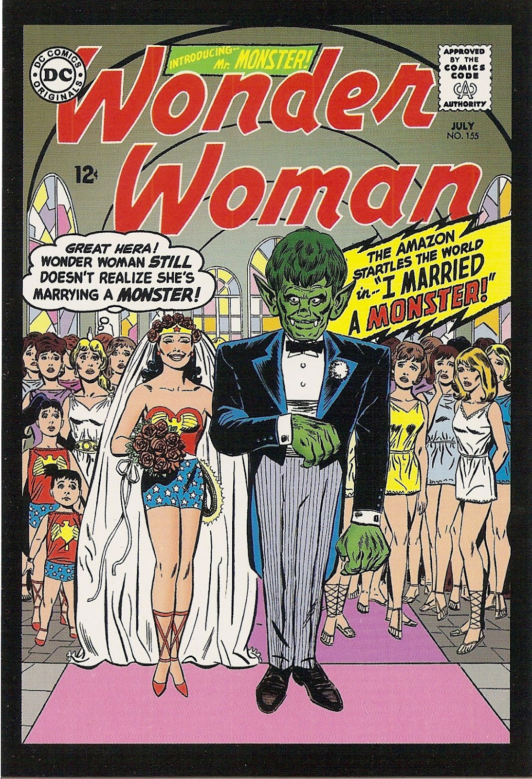
In the Papier: Weird World of Wonder Woman (Vintage DC Comics Part 2)
Excerpts from my 100 postcard collection of vintage DC Comics covers part 2!
What on earth is going on with Wonder Woman? She seems to be mixed up with all sorts of strange suitors!
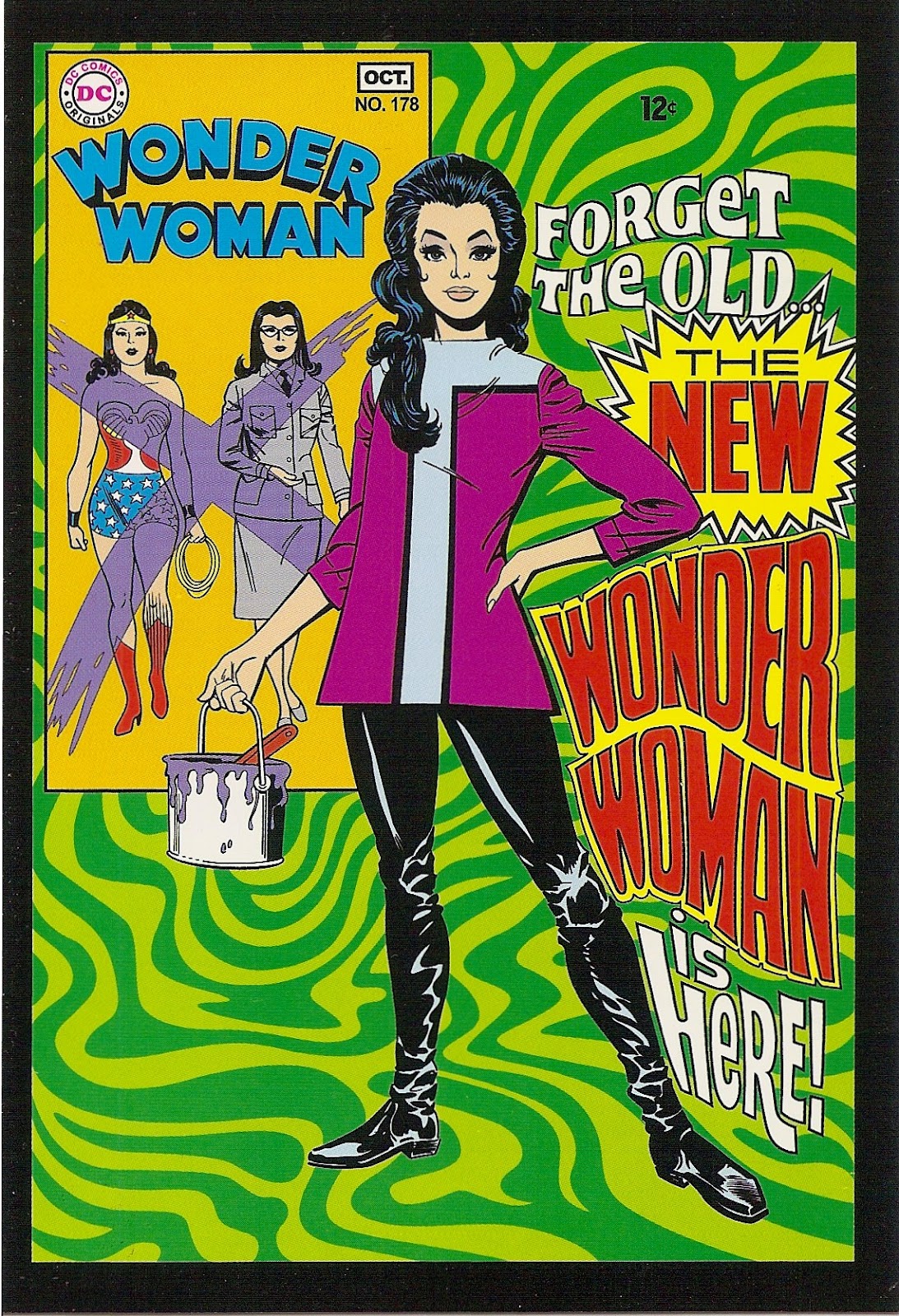
But don't worry! Wonder Woman is going to reform and wear this really awesome outfit! (and then climb aboard the U.S.S. Enterprise!)
What on earth is going on with Wonder Woman? She seems to be mixed up with all sorts of strange suitors!
![]() |
| Also, really terrible bridesmaids dresses (girls on the right)? or should I say negligees? short togas? |
![]() |
| Gee, Amoeba-Man, I wonder who's going to come out on top in this argument? |
But don't worry! Wonder Woman is going to reform and wear this really awesome outfit! (and then climb aboard the U.S.S. Enterprise!)
![]() |
| Love it! |
Wednesday, September 5, 2012
In the Papier: Distraught Superheros (Vintage DC Comics Part 1)
A friend of mine took notice of my stationary obsession and got me a wonderfully giant 100-postcard set, featuring covers of vintage DC comics. I have so many favorites I am going to have to share them with you in a couple posts. (Disclaimer: I'm not a comic book scholar in any way, so apologies if I don't take this seriously enough for some people.)
Today's feature: DISTRAUGHT SUPERHEROS
Moral of the story is, don't get close to a superhero????
And finally: THEY ALL HAVE A NERVOUS BREAKDOWN!!!!
Today's feature: DISTRAUGHT SUPERHEROS
![]() |
| WAAAAAAAAAAAAAA!!!!!!!!! |
![]() |
| Is this the end of Catwoman?????????????? **gasp gasp anxiety** |
![]() | |||||
| Even poor Robin doesn't get off easy. ROBIN DIES AT DAWN (on this alien world!). |
And finally: THEY ALL HAVE A NERVOUS BREAKDOWN!!!!
![]() |
| No! Not the COMPOSITE SUPERMAN!!!! |
Labels:
Batman,
Catwoman,
DC comics,
Green Arrow,
postcards,
Robin,
stationary,
Supergirl,
Superman
Monday, September 3, 2012
Come On Get Crafty: Card by Gran
I've mentioned in the previous post that my grandmother paints and makes cards. I've posted one of the cards she's made for me (see here), but I wanted to share one of her watercolors and another of my favorites.
I believe that she copied the design from an image she saw in a magazine. It is so beautiful, and makes me really want to learn to paint!
Sunday, September 2, 2012
In the Papier: Cape May Inns & Landmarks by Alice Steer Wilson
While visiting the Carriage House Tearoom in Cape May, I of course browsed the adjoining gift shop for the Physick Estate. And of course, I happened upon some stationary (yes, more stationary!) that I couldn't leave without.
The buildings in Cape May are beautiful and these cards (prints of original paintings) really captured their beachy suniness, the delicate and grand architecture, and attractive Victorian aesthetics. I was really glad to have the likenesses to remember and admire the place.
These paintings were all made by a local artist named Alice Steer Wilson, who painted in Cape May from the late 1960s until 2001. You can see more of her artwork and learn more about her at the commemorative website www.alicesteerwilson.com.
These paintings also reminded me of the watercolors my grandmother paints, so makes them even more enjoyable for me.
The buildings in Cape May are beautiful and these cards (prints of original paintings) really captured their beachy suniness, the delicate and grand architecture, and attractive Victorian aesthetics. I was really glad to have the likenesses to remember and admire the place.
These paintings were all made by a local artist named Alice Steer Wilson, who painted in Cape May from the late 1960s until 2001. You can see more of her artwork and learn more about her at the commemorative website www.alicesteerwilson.com.
These paintings also reminded me of the watercolors my grandmother paints, so makes them even more enjoyable for me.
Sunday, August 26, 2012
In the Papier: British book jackets
Ok, so I purchased a lot of stationary lately, hence the numerous stationary related posts.
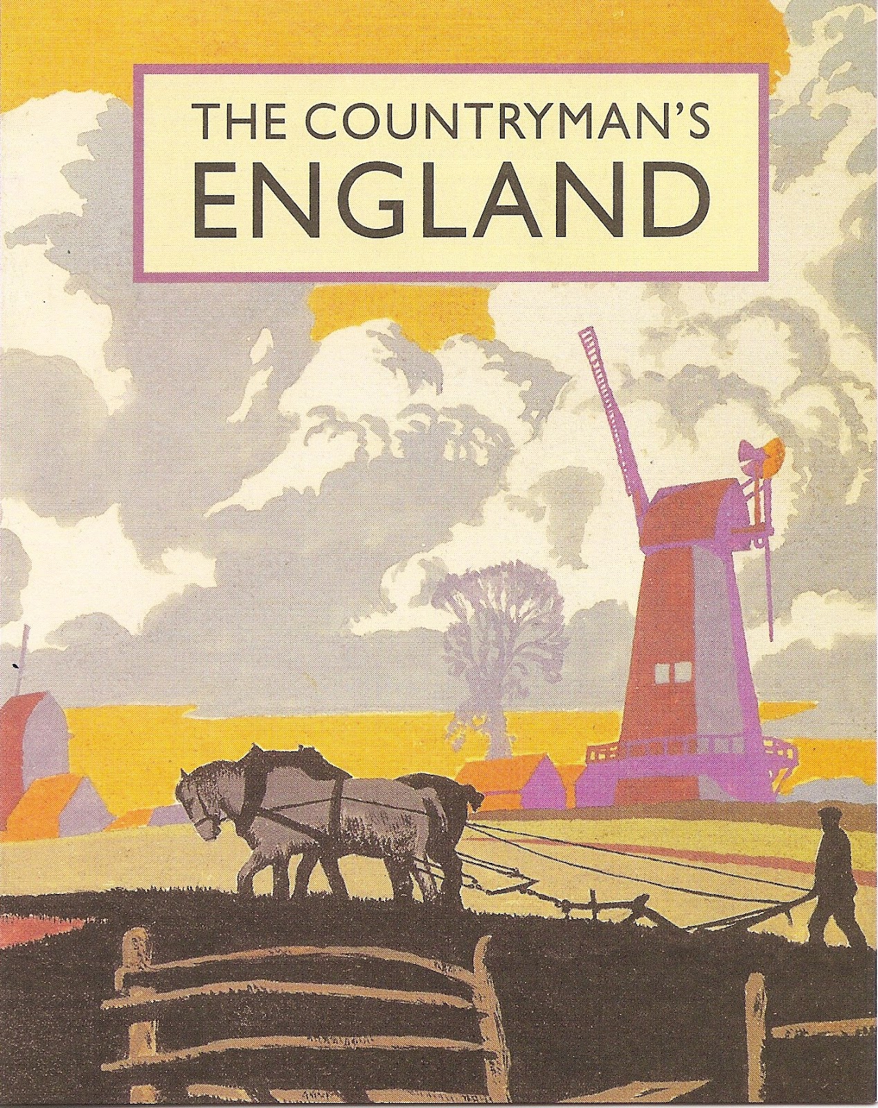
At the Winterthur bookstore, I got a box set of the grooviest notecards. These cards feature portions of vintage book jackets designed by illustrator, Brian Cook, for the Bradford Publishing firm throughout the 1930s-1950s.
It's funny to think of him designing in that period because the colorful design reminds me of the 1960s-70s and the Beatles and such. He must have been pretty cutting-edge!
At the Winterthur bookstore, I got a box set of the grooviest notecards. These cards feature portions of vintage book jackets designed by illustrator, Brian Cook, for the Bradford Publishing firm throughout the 1930s-1950s.
![]() |
| design for "The English Garden" by Ralph Dutton, 1937 |
![]() |
| design for "The Countryman's England" by Dorothy Hartley, 1935 |
Saturday, August 25, 2012
In the Papier: Historical National Park Poster postcards
My sister just sent us a few postcards from her travels, and they were really groovy.
This postcard was designed in the style of the WPA posters from the 30s/40s by Ranger Doug's Enterprises. I definitely plan to explore their site more. Ranger Doug has a blog! Gotta check it out.
This was my favorite, done in a similar style. Not sure if it is a reproduction of a vintage poster or original artwork from Lantern Press.
This postcard was designed in the style of the WPA posters from the 30s/40s by Ranger Doug's Enterprises. I definitely plan to explore their site more. Ranger Doug has a blog! Gotta check it out.
This was my favorite, done in a similar style. Not sure if it is a reproduction of a vintage poster or original artwork from Lantern Press.
Labels:
history,
national parks,
postcards,
stationary,
WPA
Friday, August 24, 2012
In the Papier: Oil Fields of Dreams
I found this vintage postcard at a thrift store in Cleveland. It's an image of a Texas oil field and is uncommonly pretty. It was the only thing I bought at the store!
Tuesday, June 26, 2012
In the Papier: Doctor Who Postcards!
A total impulse buy, but how could I not? Doctor Who postcards? Heaven!
Barnes & Noble is currently cleverly featuring a little Doctor Who table in their stores around here. So after two visits of resistance, I succumbed on the third trip. The postcards (set of 100!) come in a a TARDIS box, so even after all the postcards are gone I will still have something cool!
Most of the cards are stills from the recent season, or promotional photos (a few with a little too much airbrushing & photoshopping methinks), but I've gone through a selected some of my favorites, which often have to coolest design!
Barnes & Noble is currently cleverly featuring a little Doctor Who table in their stores around here. So after two visits of resistance, I succumbed on the third trip. The postcards (set of 100!) come in a a TARDIS box, so even after all the postcards are gone I will still have something cool!
Most of the cards are stills from the recent season, or promotional photos (a few with a little too much airbrushing & photoshopping methinks), but I've gone through a selected some of my favorites, which often have to coolest design!
![]() |
| I will always want a 'Vote Saxon' poster. I can put it on my wall on which I'm having some local hoodlums spray paint 'Bad Wolf.' |
![]() |
| The Adispose are so cute! They are one of my favorite of the recent monsters, along with the Judoon. |
![]() |
| One of the most beautiful images to come from Doctor Who recently. I super chuffed to have a copy; the original should be worth millions! |
![]() |
| Ahh! The cybermen! They are pretty freaky and ominous. |
![]() |
| There is one that says "Delete Delete Delete etc." too. |
![]() |
| And duh. Don't blink. |
Labels:
Doctor Who,
postcards,
stationary
Thursday, March 15, 2012
In the Papier: Very British, Very Fun
I tried to resist this box set from Barnes & Noble (published by teNeues), and I succeeded for a while. But eventually the world re-aligned and I used my one frivolous stationary purchase/month (one of my New Years Resolutions).
I love how iconic they are in so many ways. And full of not-stuffy nostalgia. And generally, lots of fun.

These Tula Moon cards feature the work of artist Steph Dekker, a designer and jewellery maker from Liverpool, who loves the colours, patterns, fabrics, quits and crafts from the 50s, 60s, and 70s (according to the box).
Labels:
art,
mail,
stationary,
Tula Moon
Wednesday, November 2, 2011
In the Papier: Fans Fans Fans
I bought this card for myself. It is really pretty and I don't want to send it to anyone. I want it all for myself.
So selfish!
So selfish!
The card is by Sharyn Sowell, for Sunrise Greetings.
Labels:
art,
mail,
stationary
Wednesday, October 26, 2011
In the Papier: Pigmented Insects
I love stationary.
I love sending letters and notes to people. I love writing addresses on envelopes and sticking on the stamps. But best of all, I LOVE sending people letters and notes that are a visual party. Stationary and note cards feature some really beautiful, funky and creative art, full of cool colors, shapes, images, interpretations and materials. It is so enjoyable to receive provoking visuals in the mail along with the latest news from your pals, and it is so enjoyable to browse the stationary stores and aisles until you find something you think your correspondents will get a kick out of or really really love. I still have many many cards people have sent me over the years either because they are beautiful or because I can tell the person put a lot of thought and effort into picking a card they knew I would really love or would really speak to me.
So much love can go into that simple, little physical packet of paper.
As such, I'm going to start sharing with you some of my finds, starting with these cards featuring insects against some gorgeous colors. I've started to get really into butterflies, so I think that's what drew me to these initially when I picked these up at Michael's off one of those $1 stands. They are a little cheap-looking, but still very pretty.
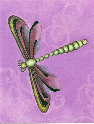
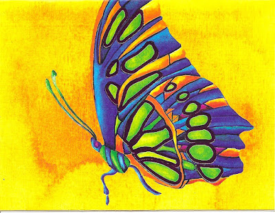
The orange one is easily my favorite.

These are done under the label "Studio18" by Rachel Tribble, and distributed by International Greetings USA.
I love sending letters and notes to people. I love writing addresses on envelopes and sticking on the stamps. But best of all, I LOVE sending people letters and notes that are a visual party. Stationary and note cards feature some really beautiful, funky and creative art, full of cool colors, shapes, images, interpretations and materials. It is so enjoyable to receive provoking visuals in the mail along with the latest news from your pals, and it is so enjoyable to browse the stationary stores and aisles until you find something you think your correspondents will get a kick out of or really really love. I still have many many cards people have sent me over the years either because they are beautiful or because I can tell the person put a lot of thought and effort into picking a card they knew I would really love or would really speak to me.
So much love can go into that simple, little physical packet of paper.
As such, I'm going to start sharing with you some of my finds, starting with these cards featuring insects against some gorgeous colors. I've started to get really into butterflies, so I think that's what drew me to these initially when I picked these up at Michael's off one of those $1 stands. They are a little cheap-looking, but still very pretty.

The orange one is easily my favorite.
These are done under the label "Studio18" by Rachel Tribble, and distributed by International Greetings USA.
Subscribe to:
Posts (Atom)